Kubernetes: There is an app for that
Turning Octant into a desktop application has long been a goal of ours, and we are pleased to announce that with the release of 0.17 we are shipping a desktop application for all three major operating systems. The command-line version will still be available for the next couple of releases to allow a smooth transition for everyone. Eventually we will be 100% focused on the desktop version.
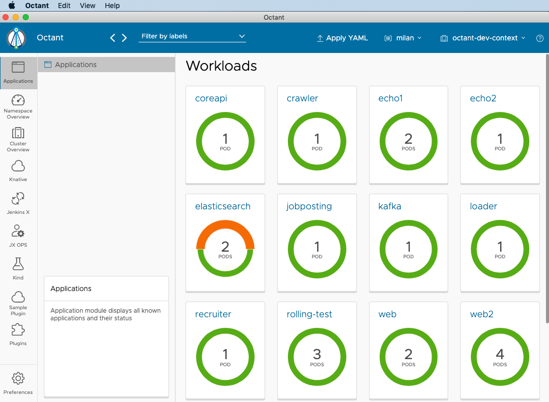
To create a desktop version of Octant, we used Electron. Electron is a popular cross-platform framework used by many well-known desktop applications. Electron is a mature technology built on top of Chromium engine with a solid production environment and great community support. Leveling up to a desktop application opens the doors for many new and exciting things Octant can leverage in the future to improve the overall user experience.
One of the benefits is access to the System tray. Octant can run in the background and be accessible with just a single click from the System tray. If you want to see the logs, you can get to them right there from the System tray. Expect more actions available from the System tray in the near future.

The header also went through a few changes. Since we are not operating inside the browser anymore, we had to add the Forward/Back buttons to the header. Additionally, header responsiveness has been improved to make it more usable at lower resolutions.
A thing to note: In this release macOS needs an additional step when running Octant for the very first time. You will have to locate Octant in Finder, control-click the Octant icon, then choose Open. More details about running unsigned apps on Mac are available here. This will be resolved in future releases.
Based on user feedback, we decided to redesign the Octant navigation in order to accommodate the growing number of Octant plugins. The left navigation is now separated into two vertical panels: a left panel with a list of all known modules and each module has its own panel to the right. Module panels contain all module specific navigation actions as well as module description at the bottom. The module description section displays the description text, we anticipate opening that up in the future to allow inclusion of more interactive UI elements. Plugin authors can use these features to improve plugin visibility and discoverability.
The first three modules at the top (Applications, Namespace, and Cluster) are built in the Octant core and always included. They are followed by a list of all installed plugin modules with Plugins and Preferences always last in the list.
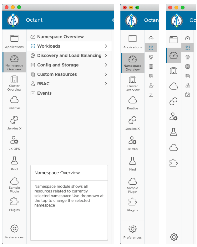
Navigation still has both collapsed and expanded states to support both novice and advanced users. The navigation state is configured in Preferences and persisted between sessions, making it easy to customize your Octant instance.
One of the goals of a navigation redesign was to move some infrequently used actions to the Preferences. As a result, theme and navigation collapsed state moved from the navigation to the Preferences UI.
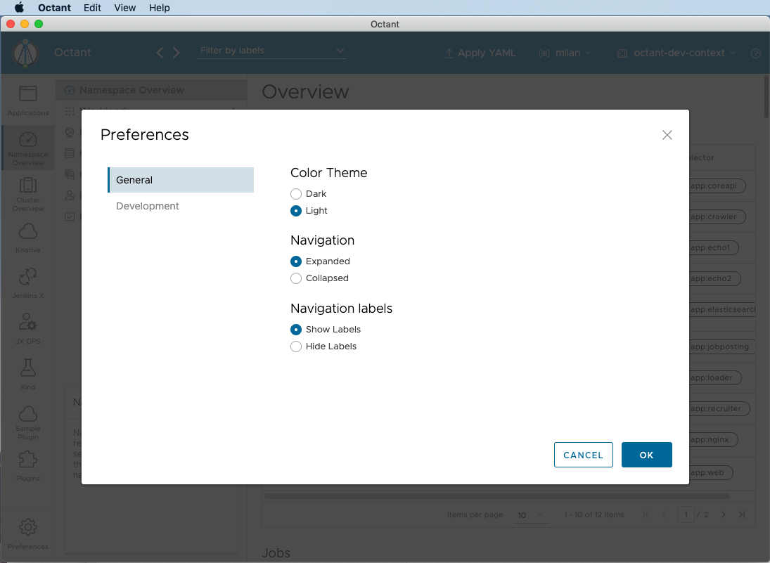
Preferences are another new feature geared towards improved configuration and customization. The Preferences dialog is always accessible through a button at the bottom left corner and offers access to all app wide preferences. Preferences also contains a Developer panel where logging verbosity can be set. This is where developers can configure the external proxy for easier development.
The breadcrumbs system has been redesigned to provide more navigation options. All breadcrumb entries with children are now turned into dropdown controls, providing an additional way to navigate directly from the breadcrumb bar. This not only provides an alternative way to quickly access related Octant pages, but it can also increase the size of the work area without limiting the navigation options when used in combination with collapsed navigation.
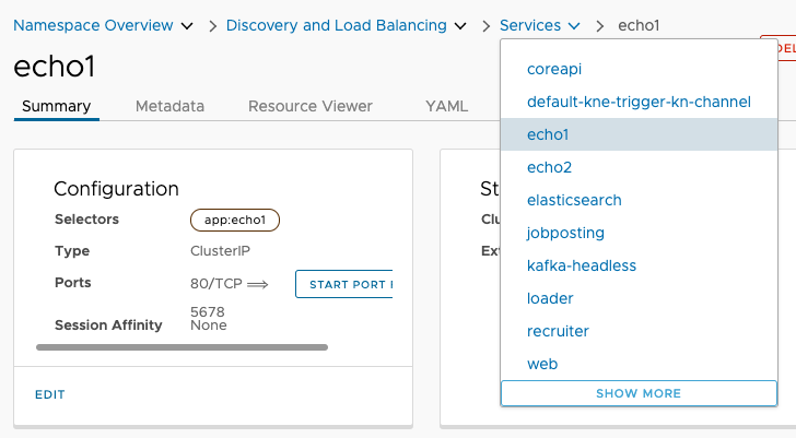
A Dropdown component has been added based on frequent community requests. The Dropdown component will help plugin developers when a single value has to be selected among multiple input values. As demonstrated with the new breadcrumbs, it can also be used for navigation.
The way the CRDs are displayed has been improved - only preferred versions of CRDs are displayed instead of all versions.
Donut charts now support custom colors, variable segment thickness and tooltips for selected segments.
Thanks to the generous contribution from our community, the node overview page now contains the pods table.
To bring the project governance to the next level, we created documents defining the community membership roles and approver forms.
The docs section in reference.octant.dev has also been beefed up to help plugin developers
The version 0.17 is available here
Related Content
Octant 0.14 - Now with Resource Creation
Octant now supports the ability to create resources for 0.16+ Kubernetes clusters and more!
Octant 0.10 - New Year, New Features
In a perfect world, you would deploy applications to clusters and nothing else would be a problem. In the Kubernetes world, it isn’t that simple yet.

 Twitter
 Slack
Slack RSS
RSS GitHub